Why Your Thumbnail Decides the Sale
On Etsy, shoppers scroll fast. Your first image is a thumbnail in a grid packed with competing listings, and on mobile - where more than half of Etsy traffic comes from - that thumbnail is smaller than your thumb. If it doesn’t stop the scroll, nothing else matters.
The thumbnail is not just the first photo: it is the ad. Everything else in the listing - price, title, description - only gets read after the thumbnail earns a click. Treat it with that weight.
Key takeaways
- Your hero thumbnail is the most important image in your entire listing - optimize it first
- Fill all ten listing slots: each additional photo answers a buyer objection and builds purchase confidence
- Shoot every piece on the same background under the same light to keep your shop grid looking cohesive
- Include at least one scale reference per listing to prevent the most common reason for returns
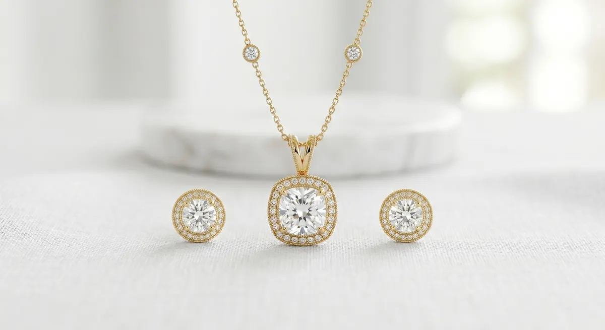
A strong Etsy thumbnail is:
- Clean and uncluttered - one piece, breathing room, nothing competing for the eye
- Cropped square - Etsy’s grid is square; landscape or portrait shots crop awkwardly in the feed
- Shot on a white or very light neutral background - it reads as professional and lets color come through accurately
- Lit to show sparkle - a single catch light on a stone or a polished metal surface signals quality instantly
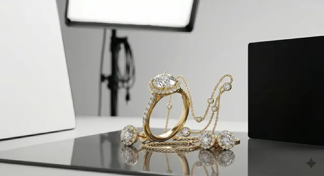
The Shot List That Converts
Etsy now allows up to ten listing photos. Use every slot. Listings that fill all ten slots consistently outperform those that don’t, because each additional image answers an objection and builds confidence.
Here’s a practical ten-shot sequence for a single piece:
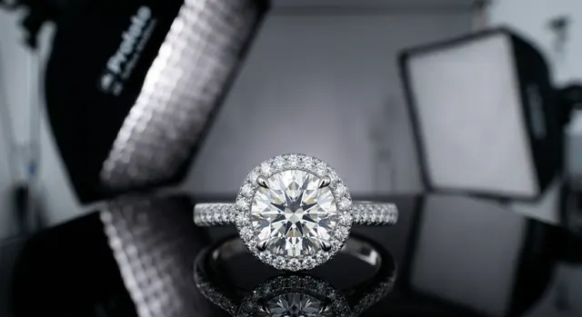
Hero shot
Clean front-on view, white or light neutral background, square crop - this becomes the thumbnail.Angle shot
45-degree or profile view showing depth and construction.Macro detail
Close-in on a stone, clasp, hallmark, or texture. This is what makes a piece feel real.Scale on hand
The single most-asked question before purchase is “how big is it?” A hand model or a coin next to the piece removes that doubt.On-model lifestyle
Worn or styled in context. Helps the shopper visualize ownership.Packaging
Shows the unboxing experience, signals gift-readiness, reduces “is this coming in a plastic bag?” questions.Back or interior view
Clasps, hallmarks, adjustable length, ring shank.Group or collection shot
If the piece is part of a set, show it together.Size chart or overlay
A photo with a ruler or callout graphic beats text alone.Second lifestyle
Different styling, different light, or a second model demographic.Backgrounds and Shop Consistency
Your shop grid is a gallery. When a shopper visits your shop page, they see all your listings tiled together - inconsistent backgrounds make the grid look chaotic and amateur.
Pick one background treatment and stick with it across your entire catalog:
- Pure white (
#FFFFFF) - clean, clinical, works well for fine jewelry and minimalist brands - Off-white or ivory - slightly warmer, easier to make look organic, popular for handmade and artisan pieces
- Textured neutral - linen, concrete, marble. Adds character but is harder to keep consistent; use the same exact surface for every shoot
Whatever you choose, shoot on the same surface, under the same light, with the same white balance. The thumbnail should look instantly at home next to every other thumbnail in your shop.
Showing Scale
Scale is one of the most common reasons buyers return or leave a negative review. They thought the pendant was larger. They didn’t realize the ring was so delicate.
The fastest, cheapest fix is a hand shot. Your own hand works fine - clean nails, neutral polish or none. Shoot the piece on or near the hand so the size relationship is obvious.
Other options that work:
- Coin reference - a quarter or 1p coin next to the piece
- Measurement callout - overlay text on the image showing “22mm × 14mm”
- Ruler in frame - less elegant but clear
Include at least one scale reference in every listing. It will reduce returns.
Color Accuracy
Etsy’s dispute resolution heavily considers whether a product “matches its listing photos.” Warm tungsten lighting, aggressive post-processing, or a phone camera’s auto-HDR can all shift gold to orange or silver to blue. The customer gets something that doesn’t match what they saw.
Accurate color is not just an aesthetic choice - it’s a returns prevention strategy.
- Set a manual white balance before every shoot. Use a gray card or a white sheet of paper to calibrate
- Shoot in RAW if your camera supports it - it gives far more latitude to correct color in post without introducing noise
- Check the final edit on a second screen or your phone before exporting. If your gold looks orange on your phone, buyers’ phones will show the same
- Don’t over-saturate gemstone colors to make them look more vivid. The stone will never look that way in real life
Mobile-First Framing
Most shoppers browsing Etsy are on mobile. That means your images are displayed at roughly 300-400px wide before the shopper taps in. Every decision should be tested at small size.
Practical implications:
- Keep the subject large in frame - a small pendant lost in a wide shot disappears on mobile
- High contrast between subject and background - a silver ring on a white background needs a subtle shadow or surface texture to read; a silver ring on a mid-gray reads cleanly at any size
- Avoid busy props - flowers, foliage, fabric folds all compete with the jewelry and compress into visual noise at mobile size
- Check your thumbnail at 150px - literally resize a browser window or screenshot to simulate how it looks in the grid. If you can’t read the piece, neither can the shopper
File Size and Resolution
Etsy recommends a minimum of 2000px on the longest side. Go higher - 3000px gives the zoom feature enough data to work well, and buyers frequently zoom on mobile.
- Export as JPEG, quality 80-90. This keeps file size under 2MB while preserving sharpness
- Etsy’s upload limit is 10MB per image, but large files slow the listing page on mobile - stay under 2MB
- Name your files descriptively before upload:
gold-leaf-stud-earrings-etsy.jpgrather thanIMG_4321.jpg. It won’t directly affect search ranking but it’s a good habit
Testing Your Thumbnail
Once your listing is live, Etsy’s built-in A/B tool (under Shop Manager → Marketing → Listings) lets you test two thumbnail variants. Run a test for at least two weeks. The variant with more clicks wins - update the listing and move on.
Even without the native tool, you can manually swap the first image, note the click-through rate over a week, then switch back and compare. A 10-20% improvement in CTR from a thumbnail change is not unusual.
Consistent testing is the difference between photographers who feel at the mercy of the algorithm and those who understand what their specific customers respond to.
For more on getting the light right before the shoot even starts, see the guide on jewelry photography lighting.
Frequently Asked Questions
What background is best for Etsy jewelry photos?
A clean white or neutral background keeps the focus on the piece and matches Etsy's marketplace look.
How many photos should an Etsy jewelry listing have?
Use all available slots - a hero shot, detail macro, scale reference, and a lifestyle or on-model image.
Related guides
Keep exploring: the complete guide, gear reviews, pricing, or find a photographer.