Key takeaways
- Flat lay works best for ecommerce grids, social content, and photographing sets of pieces together in one consistent frame.
- A camera mounted directly overhead is non-negotiable: tilted angles cause distortion and inconsistency across a catalog.
- Even, diffused light is the only lighting approach that works at this angle; hard directional light creates shadows that cut across your composition.
- Composition follows a simple grid logic: equal spacing, breathing room at the edges, and no more than one or two supporting props.
What Flat Lay Is Good For
Flat lay is one of the most versatile formats in jewelry photography. It earns its place in three contexts in particular.
Ecommerce thumbnails. A clean overhead shot on a neutral background is fast to produce, easy to keep consistent across a large catalog, and crops perfectly square for Etsy and Shopify grids. When you need to photograph thirty pairs of earrings in a session, flat lay is the format that keeps quality high and turnaround fast.
Social content. A styled flat lay with a little color, texture, and props reads well on Instagram and Pinterest because the composition fills a square or portrait frame naturally. You get a full scene in one image without needing a model or a set.
Sets and collections. When a customer is buying a matching ring-and-earring set, or you want to show a full collection at once, flat lay lets you arrange all the pieces in a single frame with clear spatial relationships between them. A hung or propped shot cannot do this as efficiently.
The Overhead Rig
The single technical requirement of flat lay photography is that the camera looks straight down. The lens plane must be parallel to the surface. Even a few degrees of tilt introduces perspective distortion that makes pieces near the bottom of the frame look larger than pieces near the top, and it makes background lines converge in a way that reads as unprofessional at a glance.
For a proper overhead rig you have three practical options. A copy stand is the most stable and repeatable: the camera mounts on a vertical column above a flat baseboard, and you adjust height rather than angle. A boom arm or friction arm clamped to a desk or shelf works nearly as well for smaller setups. For phone shooting, a flexible tripod with a horizontal arm attached to the leg works at lower heights and costs very little.
Whatever rig you use, check alignment with a grid overlay on your live view screen. Most cameras and phones display a rule-of-thirds or square grid; if horizontal lines in your scene are parallel to the grid lines, you are level.
Shoot at f/8 to f/11 for most small-jewelry flat lays. At tabletop distances this gives enough depth of field to keep everything in the frame sharp without needing focus stacking.
Even Lighting
Overhead shooting creates a specific lighting problem: your main light source cannot be directly above the camera, or it will create a hotspot in the center of the frame and flat, textureless illumination across the whole layout.
The solution is to place a large, diffused light to one side at roughly a 45-degree angle from the surface, and use a white bounce card on the opposite side to fill in shadows. A large softbox, an overhead diffusion panel, or even a window with a sheer curtain provides the kind of broad, wrap-around light that reads evenly across a whole flat lay without harsh shadows cutting through the composition.
Check for hotspots by looking at the center of the brightest piece in your layout. If you see a bright white spot with no detail, the light is too direct or too close. Move it back, add a diffusion layer, or redirect it to bounce off a white ceiling rather than hitting the surface directly.
Composition and the Invisible Grid
A flat lay that looks “messy” almost always has the same root cause: random spacing. Pieces placed by eye without reference to a consistent unit of space end up at unequal distances, creating visual tension that registers as clutter even when every individual piece is clean and well-lit.
The fix is to work to an invisible grid. Before you place any jewelry, decide on a spacing unit, say 3 cm between pieces, and apply it consistently across the whole layout. You can tape light pencil lines on the back of your surface paper as guides that show up in the setup photo but disappear when you remove them, or simply use a ruler and move each piece into position.
Leave a margin of empty space around the edge of the frame. A flat lay that goes edge to edge feels crowded. The negative space at the borders gives the eye a place to rest and makes the composition feel intentional. As a starting point, leave roughly ten percent of the frame width as empty margin on each side.
Arrange pieces in lines, clusters, or a loose diagonal, but pick one structure and commit to it. Mixing arrangements (two in a line, one off to the side, one rotated forty-five degrees) creates visual confusion. Rotating all pieces to the same angle, or using a consistent offset rotation across the set, reads as deliberate.
Styling and Props
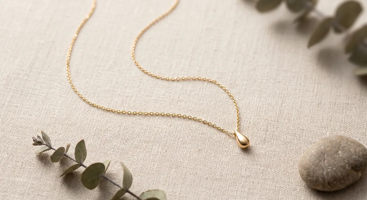
Props serve one purpose in a jewelry flat lay: they reinforce the mood without competing with the jewelry. A small sprig of dried botanicals, a folded piece of textured ribbon, or a natural stone slab under a ring can lift a flat lay from a plain product shot to an image with brand character. The key word is “small.”
Every prop you add is a potential distraction. A bold-colored flower, an oversized candle, or a prop with a pattern or logo of its own all pull the viewer’s eye away from the piece you are trying to sell. A useful test: cover each prop with your thumb and ask whether the jewelry gets more or less attention. If removing the prop makes the jewelry feel more prominent, the prop is doing more harm than good.
Use props that match the material palette of the jewelry. Gold pieces with warm tones sit naturally next to dried flowers, warm linen, and honey-colored wood. Silver and white metal read best on cool-toned surfaces like slate, marble, or pale grey card, with minimal organic props.
Surfaces
The surface is the single element visible everywhere in the frame, so it has an outsized effect on the feel of the final image. A few principles for choosing well.
Low texture reads as more professional for ecommerce because it does not compete with fine detail in the jewelry. High texture adds character for lifestyle and editorial shots but makes retouching harder if pieces need to be repositioned between frames.
Neutral color in the surface lets the jewelry carry all the color interest in the frame. A strong background color creates a mood but limits how the image reads across different platforms and uses.
Matte white paper
The ecommerce workhorse. Easy to source, replaces when it gets marked, and gives a consistent base across a large catalog. Works for every metal color and stone.Linen or cotton fabric
Adds warmth and texture for artisan or handmade pieces. Choose an undyed or very lightly toned fabric so it reads as neutral rather than colorful.Marble or stone tile
Cool, natural tone that pairs well with silver, white gold, and diamonds. Heavier to handle but durable and consistent across a long shoot.Matte grey card
The neutral alternative to white for pieces that disappear against a pure white background, such as pearl or light stone settings.Slate or dark concrete
Strong contrast surface for gold or brightly colored gemstones. Creates a moody, editorial feel that works well for social content.Light-toned wood
Warm, lifestyle-oriented base for bohemian or organic jewelry styles. Grain direction should run consistently across the frame to look deliberate.Whatever surface you use, buy or cut enough to fill your full shooting area with no seams or joins in the frame. A seam running through the background is the kind of detail that forces retouching on every single image in the session.
For techniques that carry over directly from flat lay to other necklace formats, see the guide on how to photograph necklaces.
For a deeper look at surface and backdrop options across different shooting styles, see the jewelry photography backgrounds guide.
For the complete workflow from camera settings through final export and ecommerce delivery, the jewelry photography overview covers the full process.
Frequently Asked Questions
What surface is best for flat lay jewelry?
Neutral, low-texture surfaces like matte paper, linen, or stone keep attention on the pieces.
How do I keep a flat lay from looking messy?
Use even spacing, align to an invisible grid, and limit props to one or two supporting items.
Related guides
Keep exploring: the complete guide, gear reviews, pricing, or find a photographer.