Key takeaways
- White backgrounds are the default for ecommerce and marketplace listings because they keep the focus entirely on the piece
- Black suits high-contrast stones and polished metals but requires separate background exposure control
- Textured and lifestyle surfaces add brand character for social media and campaign work
- Reflective acrylic and gradient cards can elevate a shot without needing complex setups or props
Why Background Choice Matters
The background in a jewelry photo is never neutral. It influences color perception, tells the viewer something about the brand, and shapes whether a piece looks like a bargain or a luxury item. A diamond ring on a pure white surface reads as a product. The same ring on dark slate reads as an object of desire.
Most photographers start with one background and stick with it by default. A more useful approach is to match the surface to the job. Ecommerce, social, and campaign photography each have different goals, different audiences, and different standards. Background choice is one of the fastest ways to signal that you understand what channel you are shooting for.
Pure White for Ecommerce
White is the dominant background in jewelry ecommerce for one reason: it removes every variable except the piece itself. Marketplaces such as Etsy, Amazon, and jewelry retail sites use white as a baseline so that product grids look consistent and shoppers can compare items without distraction. It also photographs color accurately because there is nothing competing for the eye.
Getting a genuinely clean white is harder than it looks. A surface that appears white in person can photograph as grey, cream, or blue depending on the light falling on it. Two approaches reliably solve this:
Lit sweep - place the jewelry on a sheet of white card or paper and position a second light source pointed at the background surface rather than the piece. This keeps the background at full white without overexposing the metal or stone.
White acrylic sheet - a 30 cm by 40 cm sheet of white acrylic (sometimes sold as “white perspex”) transmits enough light from below or beside it to glow. Shoot on it and lift the background exposure in post. Be careful not to push it so far that the metal starts to blow out.
A flat white background has one weakness on flat-lay and overhead shots: it can look completely featureless and make the piece appear to float. A very faint cast shadow, introduced by moving the main light slightly off-axis, anchors the piece and keeps it from looking like a cut-out.
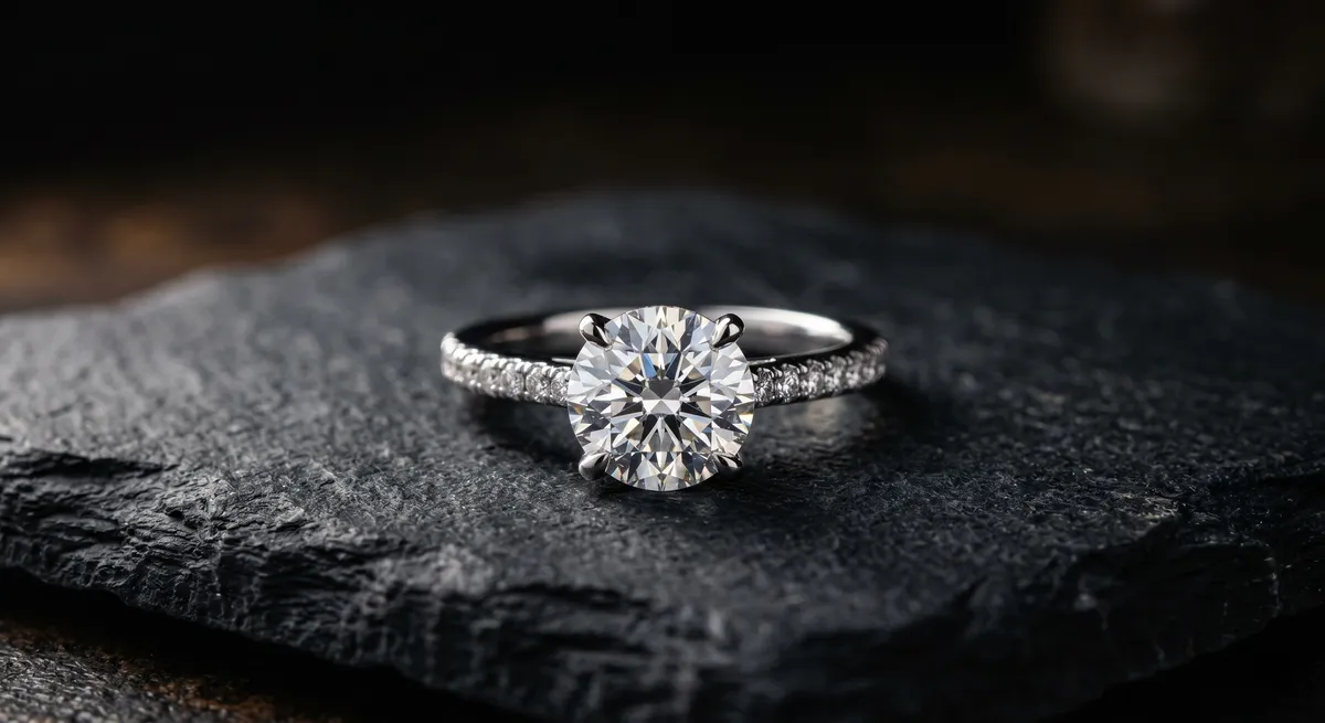
Black for Drama and Contrast
Black backgrounds do something white cannot: they make bright stones and polished metal glow. A round brilliant diamond against black appears to generate its own light. The contrast between the dark field and the faceted stone is why black has become the background of choice for high-end diamond and gemstone photography.
Black velvet is the classic surface because it absorbs almost all light that hits it, producing a near-perfect dark field. Black foam core and matte black acrylic also work; avoid glossy black surfaces unless you want the reflections they produce.
The challenge with black is exposure. Camera meters and auto-exposure systems will try to lift the overall scene brightness, which turns a rich black into a muddy dark grey. Set exposure manually, meter off the piece rather than the background, and resist the temptation to lift shadows in post - pulling detail from a near-black background often introduces noise or color shifts.
Black also works well for:
- Yellow and rose gold pieces that benefit from a warm-tone contrast
- Night shoot aesthetics and editorial contexts
- Pieces with intricate engraving or texture where you want shadows to define form
One background that fails on black is very dark silver or oxidized metal. The piece simply disappears. For dark metals, choose a mid-tone grey or a warm textured surface instead.
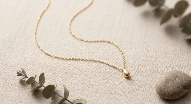
Neutral and Textured Backgrounds
Between the poles of white and black is a wide range of surfaces that add brand character without competing with the jewelry. These are the backgrounds that work for social media, lifestyle campaigns, and editorial where the goal is a feeling rather than a pure product view.
White acrylic
The workhorse ecommerce surface. Clean, consistent, and easy to correct in post. Lift exposure carefully to avoid blowing out metal.Black velvet
Near-zero reflectance makes stones and polished metal appear to generate their own light. Best for diamonds, bright stones, and high-contrast metals.Linen or cotton fabric
Soft, organic texture that suits handmade, artisan, and bohemian brand aesthetics. Warm tones pair well with gold and bronze.Marble or stone tile
Adds a luxury, editorial feel. Cold-toned marble pairs naturally with white gold and platinum. Darker stone works with bold colored stones.Concrete or cement board
Industrial and minimal. Works especially well for men’s jewelry, statement pieces, and brands with a modern or architectural identity.Reflective acrylic
Adds a mirror-like base shadow that can double the visual impact of a piece without any extra lighting or props.Props follow the same logic as textured backgrounds. A sprig of dried botanicals, a single candle, or a small dish can add lifestyle context that helps the viewer picture themselves wearing the piece. Keep props to a minimum and ensure they never outsize the jewelry in the frame. The piece should always be the subject; the prop is only there to support it.
Reflective Surfaces and Gradients
A sheet of clear or mirror acrylic creates a ground reflection directly below the piece. This reflection does two things: it adds visual symmetry that the eye finds satisfying, and it places the piece in a believable space rather than leaving it floating on a flat surface.
For clear acrylic, position the jewelry on the surface and light from the side. The piece casts a soft, slightly transparent reflection below it. For mirror acrylic, the reflection is sharper and more dramatic. Both work; the difference is how polished and high-end you want the result to feel.
Gradient cards are pre-printed or hand-blended surfaces that shift from one tone to another across the frame. A card that goes from pale grey at the top to near-white at the bottom draws the eye toward the piece without any additional lighting setup. Gradient vinyl wraps designed for product photography are inexpensive and easy to find.
Both reflective surfaces and gradients are particularly useful when shooting without a studio: they add production value to a simple tabletop setup without requiring extra light sources or complex arrangements.
Matching Background to Channel
Choosing a background should start with the destination, not with what looks nice in isolation.
For ecommerce listings and marketplace shops, white or off-white is the default. Consistency across your product grid matters as much as any individual image. Pick one white surface and use it for every product shot in the catalog.
For social media, texture and lifestyle context outperform sterile white. Instagram, Pinterest, and TikTok audiences are scrolling a visual feed where a plain white image competes poorly against organic, styled content. A linen surface, a marble tile, or a warm-toned flat lay reads better in that environment.
For campaign and editorial work, the background is part of the art direction and should be chosen to reinforce the brand’s visual identity rather than to follow any default rule. Black for drama, stone for luxury, raw materials for craft, and so on.
When shooting a single piece for multiple channels, shoot the white background version first while the setup is at its cleanest, then swap to a textured surface for the lifestyle version. You get both without doubling the overall shoot time.
For more on how flat-lay composition affects the overall look of a shot, see the guide on flat-lay jewelry photography. If background-related reflections are causing problems with polished metals, the reflections and glare guide covers exactly how to manage them. For a full overview of the photography workflow from setup to export, visit the jewelry photography hub.
Frequently Asked Questions
What is the best background for jewelry photography?
Clean white for ecommerce and marketplaces, black for drama and contrast on bright stones, and textured or lifestyle surfaces for social and brand work.
How do I get a pure white background?
Light the background separately from the jewelry, or shoot on white acrylic and lift the exposure carefully in editing without blowing out the piece.
Related guides
Flat Lay Jewelry Photography
How to Eliminate Glare & Reflections on Jewelry
Jewelry Photos for Etsy That Sell
Keep exploring: the complete guide, gear reviews, pricing, or find a photographer.