Key takeaways
- Gold reads wrong when white balance is off or when a colored surface casts a tint onto the metal
- Set white balance with a gray card so the camera records warm gold, not sickly yellow or greenish alloy
- Gold mirrors the room, so warm or neutral cards placed just out of frame give it a rich, saturated tone
- Diffuse your light source so highlights are smooth gradients rather than blown-out hotspots
- Remove colored objects from the set entirely, including fabrics, backgrounds, and your clothing
Why Gold Reads Wrong in Photos
Gold is both a mirror and a color swatch. It picks up every color from its surroundings and blends that into its surface. Three problems cause most off-color gold shots.
Auto white balance. The camera reads the whole frame and tries to neutralize it. A warm gold ring pushes the algorithm to cool the image, and the metal ends up looking pale or greenish.
A colored surface nearby. Gold reflects everything. A green cloth, a tinted background, or even a brightly colored wall two feet away throws a tint across the surface that no slider in post can fully undo.
Low CRI light. A source rated below CRI 95 drops certain wavelengths. Gold alloys are sensitive to the red-channel shifts that low-CRI sources produce, and the metal appears flat and stripped of its warm saturation.
Setting White Balance With a Gray Card
Place a gray card in the frame where the piece will sit, under the exact light you will use. Take a test frame, then set that frame as your white balance reference. Every subsequent shot in the session will be balanced to that reading. In Lightroom or Capture One, apply the same white balance to the entire batch with one click.
Shoot raw. JPEG white balance is baked in and much harder to correct after the fact, particularly on warm metals where the orange and yellow channels are already pushed.
Shaping Reflections With Warm and Neutral Cards
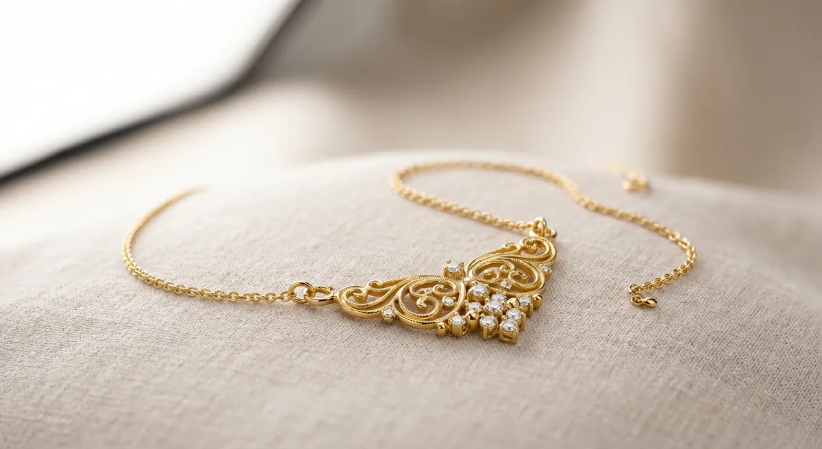
Gold reflects whatever surrounds it. Left to chance that means ceiling lights and random room color; controlled deliberately, it means a warm, richly saturated surface.
Place a large white or slightly warm card just out of frame on the shadow side. It fills the metal with a warm, even reflection that reads as depth. For rose gold, a card with a hint of warmth amplifies the pink-orange quality of the alloy without tipping into an orange cast.
A thin black card on the opposite side creates a crisp dark edge reflection that defines curves on a ring shank or chain link and tells the viewer the surface is polished.
White fill card
Bounces even light into the shadow side and gives gold a continuous, warm tone across curved surfaces.Slightly warm card
Amplifies saturation in yellow gold and rose gold alloys without casting orange onto the background.Black flag
Creates a defining dark edge reflection that reads as a polished, high-quality surface.Gray card
Used before the shoot to lock white balance, not as a reflector during the shot.Diffuse the Light
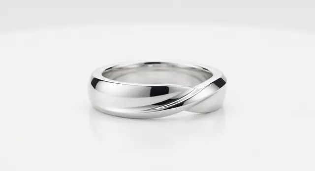
A bare bulb reflects as a harsh, blown-out point in polished gold. A large softbox, diffusion panel, or bounce card replaces that point with a smooth gradient that follows the curves of the metal. Position the softbox at 45 degrees above and to one side so the highlight starts bright at the top edge and rolls off toward the shadow.
Use a CRI 95 or higher source. Lower-rated lights drop the warm wavelengths that give 18 k and 22 k gold its character.
Polished vs Brushed Gold
Polished gold is a near-perfect mirror and responds to every card and diffuser position with high contrast. Brushed or satin-finish gold scatters light in multiple directions, so even illumination from a light tent or overhead panel works better than a single directional source. Flat, shadow-free light lets the texture read cleanly across the whole surface.
Keeping Color Accurate End to End
Export in sRGB for web. Adobe RGB files display as washed out in browsers that are not color-managed, and gold’s warm saturation takes the biggest hit. Do not boost vibrance or saturation in post to compensate for a color problem at capture. Pushed saturation on gold shifts the orange channel into territory that looks artificial and no longer matches the physical product. Fix the source: white balance, CRI, and what is reflecting in the metal.
For techniques on controlling reflections across all metal types, see the guide on controlling reflections in jewelry photography. If you are shooting silver alongside gold, the approach differs in several key ways covered in the how to photograph silver jewelry guide. The jewelry photography overview covers the complete workflow from setup to export.
Frequently Asked Questions
Why does my gold jewelry look green or off-color in photos?
It is usually white balance or a color cast from a nearby surface or light. Set white balance with a gray card and remove colored objects from the set.
What light is best for gold jewelry?
Soft, diffused, high-CRI light. Gold looks richest when the reflections are shaped with neutral or warm cards rather than left to the room.
Related guides
How to Photograph Silver Jewelry
How to Eliminate Glare & Reflections on Jewelry
Jewelry Photography Lighting Setup
Keep exploring: the complete guide, gear reviews, pricing, or find a photographer.