Why Watches Are Different From Other Jewelry
A ring or pendant is read from one angle. A watch has four distinct surfaces to manage at once: the dial under the crystal, the polished crystal itself, the case and lugs, and the strap or bracelet. Each surface reflects light differently, and a setup optimized for one will often flatten or blow out another.
Add to that the mechanical detail the viewer expects to see: printed indices, applied markers, sword-shaped or baton hands, a date window, and often an engraved crown. If your lighting flattens the dial or buries the hands in glare, the image reads as a snapshot rather than a product shot.
The good news is that the watch has a standardized, repeatable look developed over decades of brand advertising. Learn that framework and you have a foundation you can tune for any timepiece.
Key takeaways
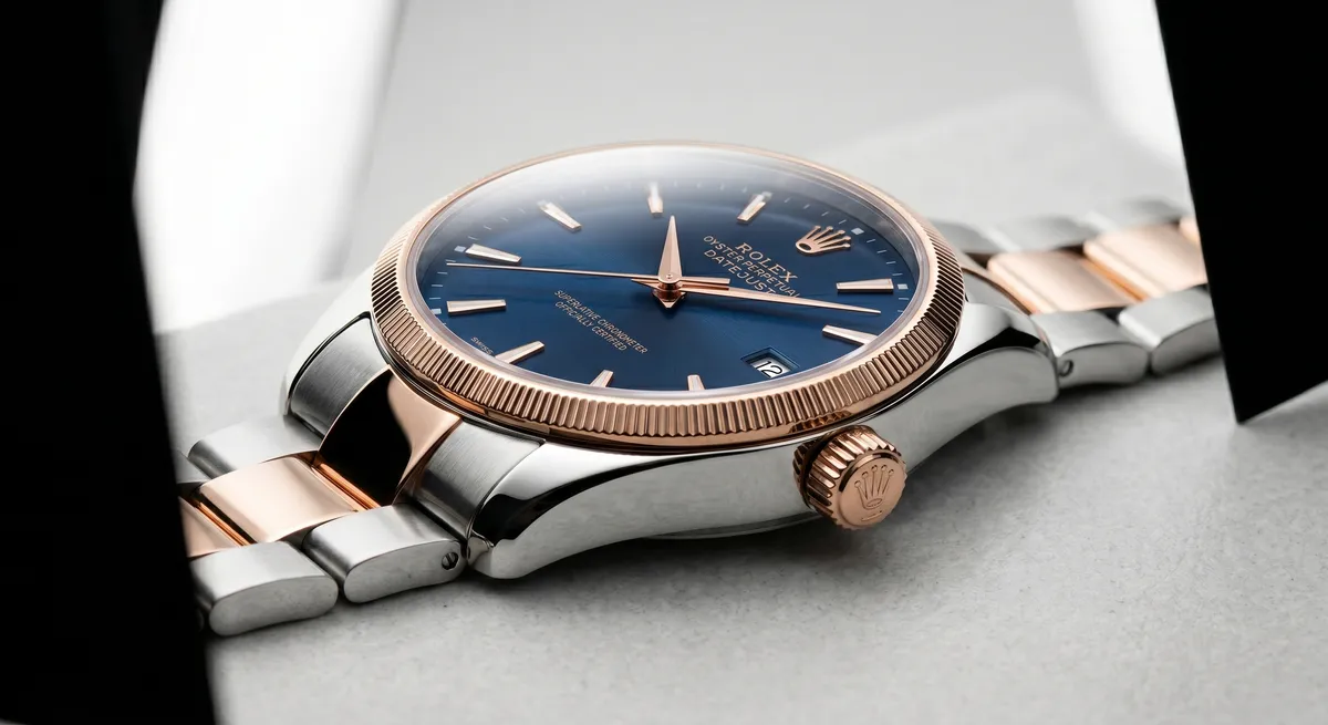
- Set the hands to ten past ten before every shot so the dial looks balanced and the logo is clear
- Light through large diffusion so the curved crystal reflects soft white gradients, not bare bulbs
- Use black flags just out of frame to separate the case from the background and add depth to the metal
- Shoot macro passes for the crown, lugs, and bracelet so buyers can see construction quality
Prep and Setting the Time
Before any light is positioned, the watch needs to be ready for camera.
Wipe the case and crystal with a microfiber cloth. Polished steel and sapphire crystal collect fingerprints in minutes, and those oils catch light at angles you cannot remove with a flag. Wear cotton gloves or handle the watch by the strap from this point forward.
Set the hands to ten past ten. This specific position has been used in watch advertising since the mid-twentieth century for three practical reasons: the hands frame the brand name printed at twelve, the symmetrical position reads as balanced and authoritative, and the open space at six o’clock keeps the hands from obscuring sub-dials or date windows that usually sit there. If the piece has a date complication, wind it to a date that looks clean in the window, typically a single digit or a round number.
Wind the movement fully so the seconds hand is in motion and the power reserve is not dragging the hands. For automatic watches, rotate the crown or shake the watch gently so the rotor charges it before you set it down.
The Curved Crystal and Reflections
The crystal is the hardest surface to manage in watch photography. Sapphire and mineral glass are curved in two planes on most dress watches, which means the surface reflects a wide angle of the room simultaneously. Point a bare softbox at a watch and the crystal becomes a bright, featureless oval. You lose the dial underneath entirely.
The practical fix is to light through a large diffusion panel positioned above and slightly behind the watch. The crystal then reflects a smooth white gradient that fades from bright at the top to mid-tone lower on the dial. That gradient reads as polished glass rather than glare.
Once the main diffusion is in place, use small black flags just outside the frame to darken the reflection at the edges of the crystal. The contrast between the bright central gradient and the darker edge gives the glass its three-dimensional curvature. Without flags, the crystal goes flat.
If any ambient room light or ceiling reflection appears in the crystal despite diffusion, kill the room lights entirely and shoot in a controlled environment. Even a distant window can register in a curved crystal at certain angles.
Lighting the Dial for Readability
The dial needs to be readable. Indices, printed text, and hand edges should all be clear at the image’s final display size. This is a different goal from the kind of dramatic side-lighting that works on a ring shank, and it requires a different approach.
Top diffusion panel
Position a large panel overhead and slightly forward so light falls evenly across the dial without hot spots on individual markers.Fill card below
A small white card angled up from in front of the watch bounces soft light under the crystal, lifting shadow on the lower half of the dial.Accent for the hands
A narrow strip of light from a flag-controlled source catches the edge of applied hands and markers, giving them separation from the dial surface.Avoid side-lighting alone
Raking light that works on a textured dial will flatten a printed one and create uneven brightness across the indices.The hands need their own catchlight. Applied gold or rhodium-plated hands have a bevel that catches a narrow angle of light; if your key source is not in that angle, the hands merge with the dial. Move the key slightly until you see a thin bright line along the leading edge of both hands. That line is what separates a readable dial from a muddy one.
Metal Case and Bracelet Reflections
The case and bracelet behave like any polished jewelry: they record the room. The same diffusion and flag technique from dial lighting applies here, but the geometry is different because the case sits at a right angle to the dial.
Polished case sides look best with a thin, defined dark stripe running along their length. This is a reflection of a black flag placed just outside the frame on the camera side. Without it, the case edge merges with the background and loses its shape.
Brushed or satin-finished cases on sports watches need a different approach. The brushed finish scatters light, so you want even, directionless illumination to keep the texture consistent across the surface. A light tent or overhead panel works well here.
Bracelets with alternating polished and brushed links need both treatments at once, which is where watch photography becomes genuinely challenging. Light the polished links with defined flag reflections and let the brushed links take the diffuse fill. The tension between the two finishes is part of the bracelet’s design; a good lighting setup makes both readable.
Macro Detail Shots
A single three-quarter hero shot is not enough for a watch listing or editorial feature. Buyers and readers want to see the construction up close.
Crown and winding stem
The crown is often engraved or guilloche-cut. A macro shot from the three o’clock side reveals that detail and the thickness of the case.
Lugs and case side
Shoot at case level, parallel to the dial, to show the lug shape and finishing quality. This angle also reveals whether the case edges are sharp or softened.
Clasp and bracelet end link
The clasp is a trust signal: a well-finished deployant reads as premium even in a thumbnail. Light from the side to pick up the engraving or brand marking.
Strap texture
Leather, rubber, or NATO straps all have surface texture that reads in macro. A raking light from the side picks up the grain without washing out the color.
For all macro work, use a tripod and a focus rail. Depth of field at 1:1 magnification is shallow enough that even the vibration of pressing the shutter can shift the plane of focus. Use live view, zoom to 100 percent on the target detail, and trigger with a remote or the camera timer.
Backgrounds
Most commercial watch photography uses one of three backgrounds: pure white, matte black, or a contextual surface that reinforces the brand positioning.
White backgrounds are standard for e-commerce and catalogue work because they separate cleanly in post-processing and keep the focus on the dial. Light the background separately so it reads 255 in the histogram without spilling onto the case.
Black velvet backgrounds suit dress watches and vintage pieces where the darker mood adds to the appeal. The case highlights read brighter against black, which accentuates finishing quality.
Contextual surfaces such as slate, wood, or fabric are used in lifestyle and editorial work. Choose a surface texture that does not compete with the bracelet finish: a rough slate pairs well with a brushed sports watch but fights with a polished dress bracelet.
Whatever background you use, keep it consistent across all shots in a set so the images work as a cohesive group.
For a full breakdown of managing reflections in polished metal, see How to Eliminate Glare and Reflections on Jewelry. For lighting setups that transfer directly from jewelry to watch work, see Jewelry Photography Lighting. The jewelry photography overview covers the full studio workflow from surface prep to final export.
Frequently Asked Questions
Why is the time set to ten past ten on watch photos?
The classic ten past ten position frames the brand logo, looks balanced, and keeps the hands clear of the dial markers.
How do I stop reflections on the watch crystal?
Light through diffusion so the crystal reflects soft white, and use black flags just out of frame to remove distracting reflections from the curved glass.
Related guides
How to Eliminate Glare & Reflections on Jewelry
Jewelry Photography Lighting Setup
How to Photograph Gold Jewelry
Keep exploring: the complete guide, gear reviews, pricing, or find a photographer.